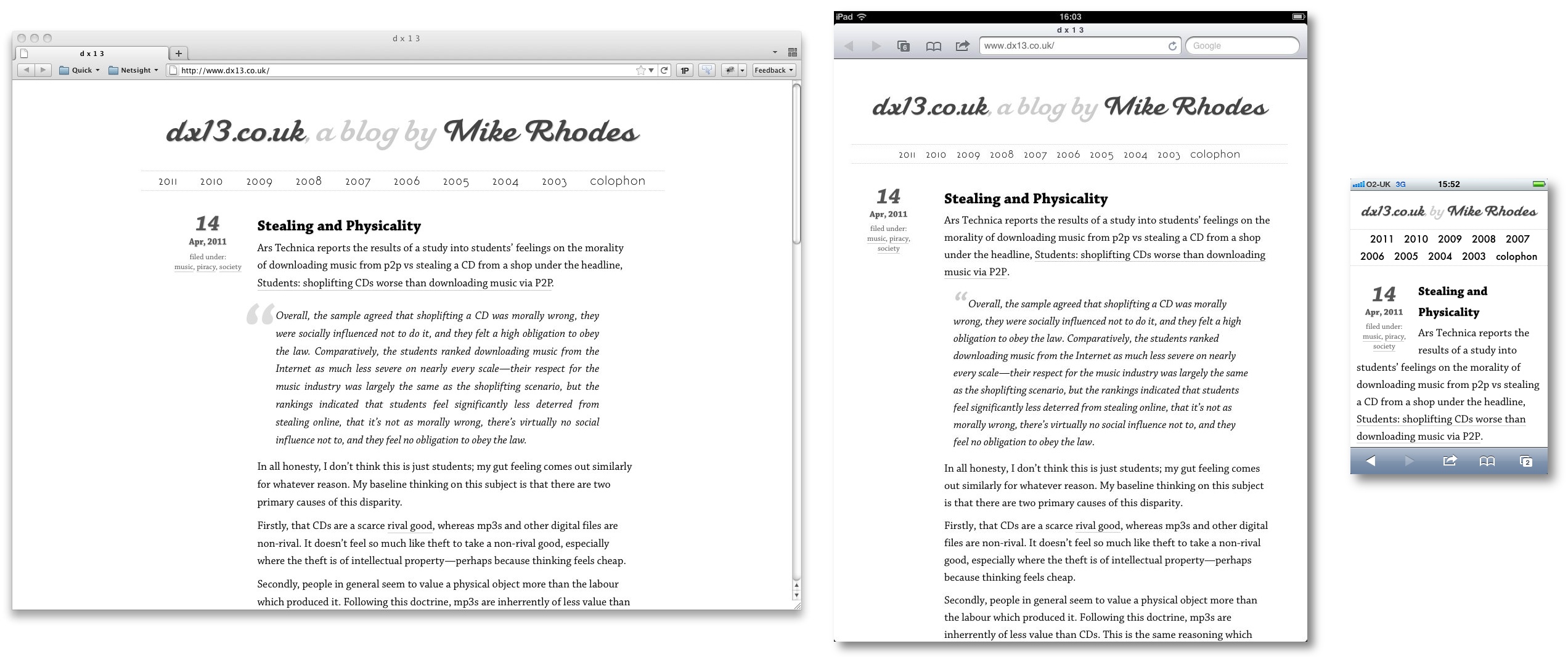
Since I bought an iPod Touch in 2007, stashed away at the back of my mind has been an intention to make this site better on small screens. Finally, over the past week I’ve done this, partly to get a bit more of an idea about responsive design.
As we’ve created ever more devices able to access the “full web”—rather than the constraints of basic HTML or, god forbid, WAP—it’s become more and more obvious that designing for the typical desktop browser creates a decidedly sub-optimal experience for those on other devices, in particular phones with their dramatically smaller screens. This site has been fairly unpleasant to use on a phone for a long time.
One of the things that has bothered me is the trend toward creating phone-like versions of websites. That horrible WordPress theme which apes the iPhone aesthetic, badly, is one of the prime culprits. I’ve tried very hard to maintain this site’s feel while producing a version which works well on a small screen:
A quick guide to making your phone-aware styles
Use the viewport tag. It helps immensely when working with phone and tablet browsers. Apple’s developer documentation has a good document on the viewport tag and its use.
In short, this tag is required because the iPhone and iPad will, by default, render a page at a much bigger width than their real one, to support rendering unoptimised websites. If you are designing specifically for the constraints of the small screen, you need to turn this behaviour off as otherwise Mobile Safari will assume it should render your page at about 900px wide.
There are many options for the viewport tag, but I found the below combination easiest to work with.
Add CSS3 media selectors with your custom style sheets. CSS3 media selectors allow you to finely tune the devices where a particular style sheet is used, beyond simple screen/print declarations available with earlier versions of CSS. I found it easiest to use two style sheets, one for 900px width and below, and a further set of customisations at 600px and below.
First the link tags for 900px and below:
And for 600px:
Using both the max-width and max-device-width links works well. max-width applies to desktop browsers, but max-device-width works more reliably with device-based ones. Using this setup, you can prototype on a workstation browser using tools like Firebug to help, before tweaking on the small screen.
Write your style sheets. As mentioned above, I found it easiest to first write one with minor customisations targeted at tablet size screens, of 900px and below. All this style sheet does is to change the layout of the site from fixed to fluid width to avoid content overflowing the page. It’s effectively targeted at the iPad as that’s the only test device I had to hand.
After tweaking for the iPad, I wrote a more invasive style sheet to alter the layout of the page for phone-sized displays. As dx13 is a single column, this didn’t have to do significant amount of work really: it’s mostly around bringing post metadata inline with body text and altering quite a font sizes to fit things into the smaller screen. This one is applied at 600px and below, as that’s the width where the previous layout starts to glitch.
Use percentages for widths in particular. My final tip is to work in percentages for your site when designing for phones and tablets, as otherwise it’s very easy to end up with odd looking pages when you change from device to device, and even from portrait to landscape orientation and the precise dimensions of the browser viewport changes. I first tried to work directly in pixels to tailor for the iPhone’s screen, but quickly realised that was a bad idea.
In addition to using percentages throughout the phone and tablet stylesheets, I found it very helpful to (re)set the html and body width to 100% first thing in my phone and tablet CSS files. If you want padding or margin, make sure the total width is 100%, of course:
A couple of notes:
- There are still some pixel measurements in there. Some things just require a certain amount of space, and I wasn’t designing for pathological edge cases. When you know the rules, you can break them where appropriate.
- I took out several non-essential portions of the page from the display on the phone in particular. A simple
phone-hideclass withdisplay: nonein the CSS is used for this. I wanted to preserve full access to the site on a phone, but some things are just clutter.
Overall, it didn’t take as long as I thought to tweak the layout once I’d worked out how I wanted it to look. The viewport tag, max-device-width and percentage widths were the main hiccups for me.
Updates
You live and learn; here are tips I found out after writing this post.
3/6/2011: My fonts have inconsistent sizing. I noticed that sometimes fonts change their size when going from portrait to landscape. It can also be that fonts which have the same style information display in different sizes. Safari sometimes tries to tweak your font size for legibility, but this can give odd renderings.
There is a good stackoverflow answer covering the issues involved, but adding the following to your stylesheet will probably help: