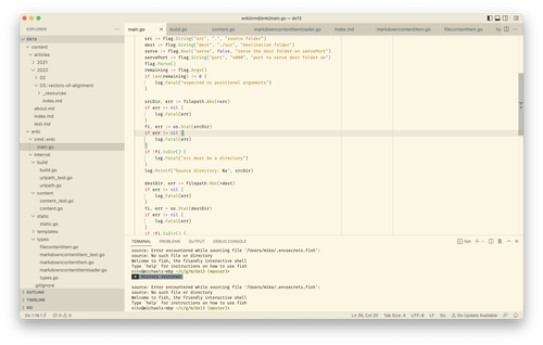
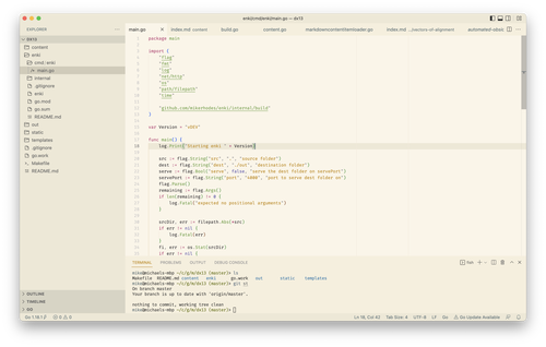
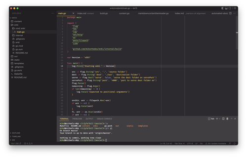
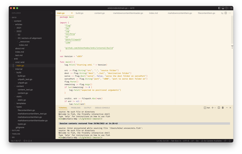
On and off for the last couple of months, I’ve been working on a theme for VS Code. It’s a light version of my favourite dark theme, Monokai Pro. Sadly I can’t share it as it amalgamates two different VS Code themes, one person’s theme suggestions in a GitHub comment and my own tweaks. I’ve no idea how that works for licensing, so I’m playing it safe.
Instead, I’ll share how I got there, because sometimes it’s good to read about a journey. If it inspires you, all the better.
Genesis
A year ago, I came across Monokai Pro, a dark VS Code theme. The theme was created by the original author of the Monokai colour set that’s been ported to almost every editor in existence. It’s the only theme I’ve ever seen come with a (small) price tag. But it shows. Monokai Pro has been crafted. It is a pleasure to use.
But Monokai Pro is a dark theme. After a while, I moved my desk from facing a wall to facing a window. As winter became spring and spring became summer, the days brightened, and the dark Monokai Pro became harder and harder to use against the the bright window. I needed a light theme.
I’m not the only one to think about a light version of Monokai Pro. In fact, there’s a long GitHub issue about it. In amongst the comments on this issue, there’s one particular comment where the author experimented with a light syntax theme. They darkened some of the key Monokai Pro colours and provided the mapping from several original colours to new ones that they had used. While this just altered the text editing area – the editor’s background and the syntax highlighting – I really liked how the colours looked in the screenshot in the comment. After pining for a little while, I realised that I could port these changes into my own version of Monokai Pro.
Building the theme
First, I exported a copy of my local version of the Monokai Pro theme. I next used sed
to brute force replace all occurrences of each colour per the remapping in the comment on GitHub. After this, what I had was an editor pane with a light colour theme. I tried coding in it for an hour or so. Even with this minimal work, I could see the theme had potential.
At first I concentrated on the editor syntax colours. In the main, these stood up fine, but I did make a few tweaks. The most important of these was darkening the colour used for strings to have greater contrast; at least for my eyes, the lighter yellow-orange used made me squint. I used GitHub’s Primer Prism to help. It has a feature where it grades colours against a given background colour for reading contrast. This allowed me to find a darker version of the same yellow-orange hue that had a better readability rating. I also altered the indent guides, rulers and line numbers where the original theme’s colours didn’t work against the lighter editing background. Probably some other bits too; sadly the git history is a bit of a mess as I was just playing at this stage.
After a few more hours in the editor, I had fallen for the editor colours and was convinced it was worth spending more time to get the theme right, even if it was just for myself. Spending time coding using the colour scheme had showed that the colours just somehow worked. IThere are a lot of colours in an editor syntax theme, and only a subset of them were affected by the changes in the GitHub comment and my subsequent tweaks, so many were still the same colours as in the original dark theme. One might not have expected them to work well against the light background. But they did; I was surprised.
However, while the editor colours worked well, others did not.
One problem that quickly became apparent was that my brute force find and
replace with sed had altered some of the colours used in the sidebar. As that meant I’d darkened colours that were still displayed against a dark background, here
and there things had become unreadable. Over and over I tweaked the sidebar
colours. But after another ten minutes or hour, I’d spot another problem. And another, and another. And each time, I ended up picking just some colour that worked out of Prism, meaning I was getting further and further from Monokai Pro. While at some point I realised it’d be smarter to diff against the original sidebar colours, I’d decided by this point that the dark sidebar wasn’t working well for me against the lighter editor theme. Something was off about the tabs as well.
I wasn’t happy with where I was. I feared I was mangling the theme. While I still liked the editor theme, I wanted a proper, rather than hacked up, light chrome theme to go around it. But I didn’t feel I had the skill to create this light theme from scratch.
When talking the problem over with a friend, an answer suddenly presented itself – and it was obvious in retrospect. I could keep the editor colours I loved so much but replace the chrome colour scheme with that of another theme instead of building my own. Of course, given the editor background colour, the theme that seemed obvious to try with my editor colours was Solarized Light, which has very similar off-yellow colours. So I exported the Solarized theme that comes with VS Code. For my first go, I just replaced the editor syntax theme and editor background colour with the ones from my edited Monokai “light” theme.

So I set about altering the hybrid theme to my tastes. As the basic chrome and editor themes were sound, I could afford to be more careful and targeted with my edits, and I could try to ensure they stuck better to the spirit of the theme by being intentional in my colour choices.
For the terminal background, I used this tool to find the midpoint of Solarized base3 and base2. I also applied this colour to the tab background. Finally, I used the ruler, indent and line number colours from the original tweaks I’d applied to the non-Solarized Monokai Light theme. I’d generated these using Prism by darkening the editor background, so they already fitted nicely into the theme.


