Apple flagged watchOS 10 as “the biggest update since the introduction of Apple Watch”. And it is quite a large set of changes. This is a quick post about how one change made a big difference to the day-to-day UX of my watch.
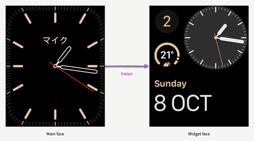
I like a plain watch face with few complications. In fact, my favourite has only one complication, a monogram, which is mostly there to help me quickly orientate to the watch face. I did want quick access to certain information, however, so I had a second face that I could swipe to containing the date, temperature and an Omnifocus task count. It looked like this:
“マイク” is a close approximation to Mike in Japanese characters, something like “mi-ku”; meaningful but not intrusive on the face.
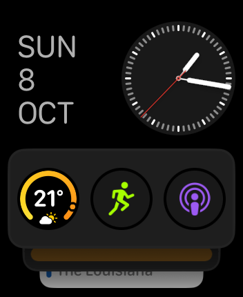
With watchOS 10, I’m instead able to use the smart stack feature. This has two big benefits:
- Changing watch face never felt a first-class gesture, while the swipe-up for smart stack is definitely well-tuned and always works first time.
- Complications on the inactive watch face didn’t get any background time to update. This was particularly noticeable for the weather widget, where it would run out of downloaded forecast to show (one needed to stay on the watch face for a while before it would be allowed to update, so quick glances at the face didn’t result in new forecasts). Smart stack widgets seem to be allowed background update time.
Omnifocus hasn’t released a smart stack update yet, so I only have the weather in my set of mini-widgets pinned to the top of the stack. But when it does, I’ll have everything I need, and it’ll all work far more smoothly.

Nice work 💪
