I’m interested in how we can create software that’s malleable for people’s needs. I think AI can be a tool to achieve this.
Let’s talk about one aspect of that malleability: how things look. How can AI help with this?
Sadly, by default, AI output is a consistent “non-style”. Even Anthropic call it “AI slop”, suggesting breaking this mold by telling the model:
You tend to converge toward generic, “on distribution” outputs. In frontend design, this creates what users call the “AI slop” aesthetic. Avoid this: make creative, distinctive frontends that surprise and delight.
Later, Anthropic note that some hallmarks of this style are large border radius, system fonts, and (oddly specific!) purple gradients. I tested this out with a few prompts.
I quickly knocked up a demo app to show this. Its purpose is telling you how long a given size of integer will take to rollover, which can cause problems. But what we’re interested in is how it looks, which… isn’t great:
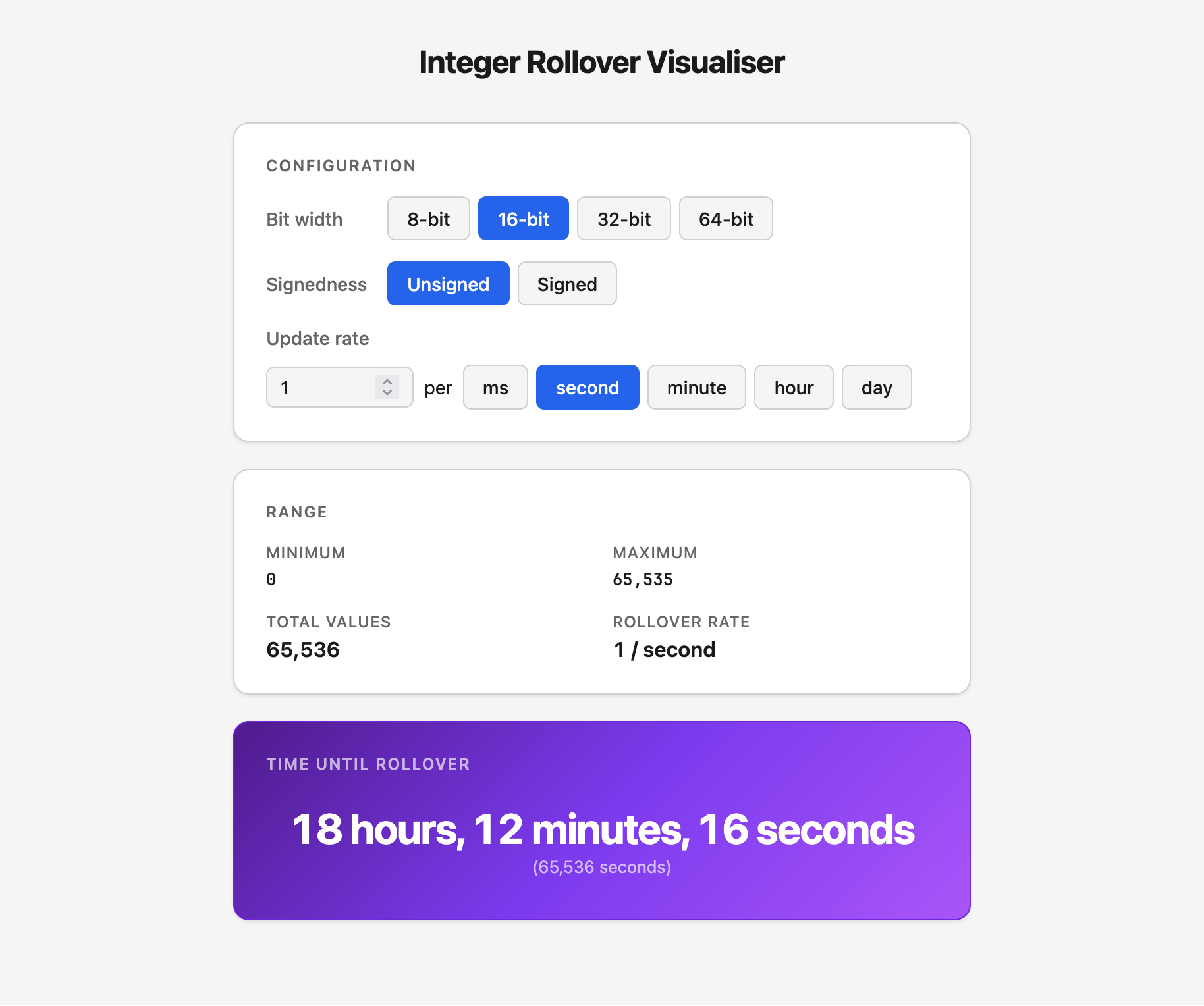
- Large border radius — check!
- System fonts — check!
- Purple gradient (🤷) — double-check!
But thankfully this is only what comes out of the model by default. With a little work, we can steer the model towards much improved designs.
So how can we bend the styling to our will? One way I’ve come up with is: write a Claude Skill that contains a design system using a style I like. Here’s the result:
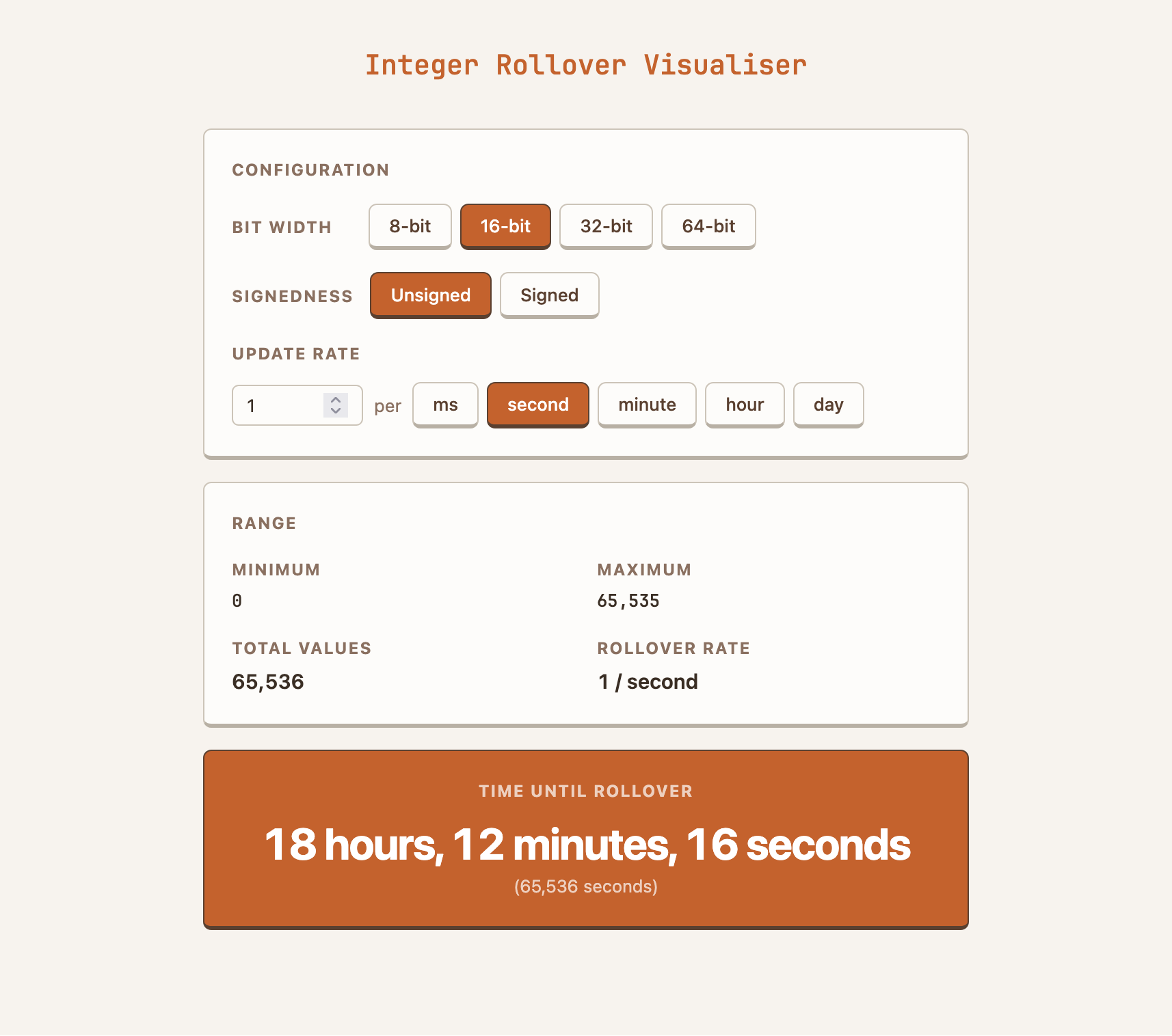
Same layout, nicer design. At least for my tastes. But this approach is easily adapted to whatever your taste is!
Otherwise, read on for how I got the idea, and built it. It’s a bit of narrative rather than a guide, but it’s got lots of screenshots and prompts to inspire along the way.
Genesis
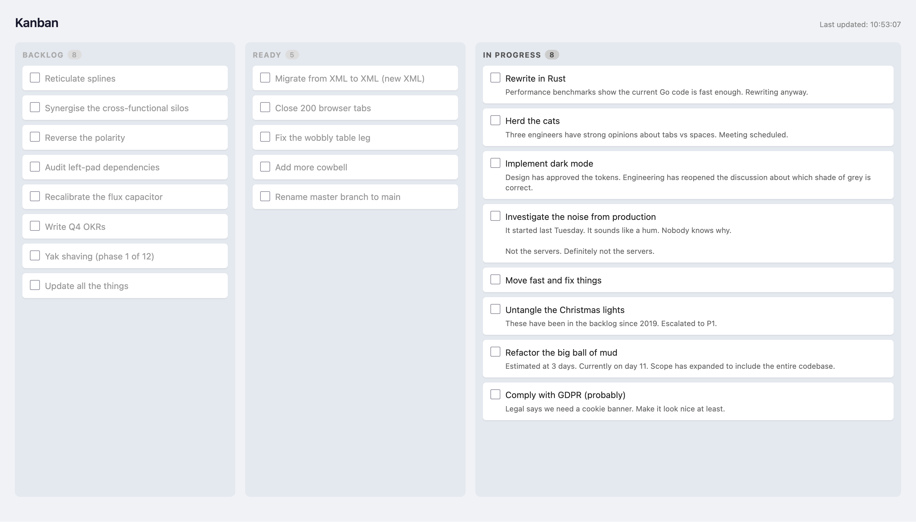
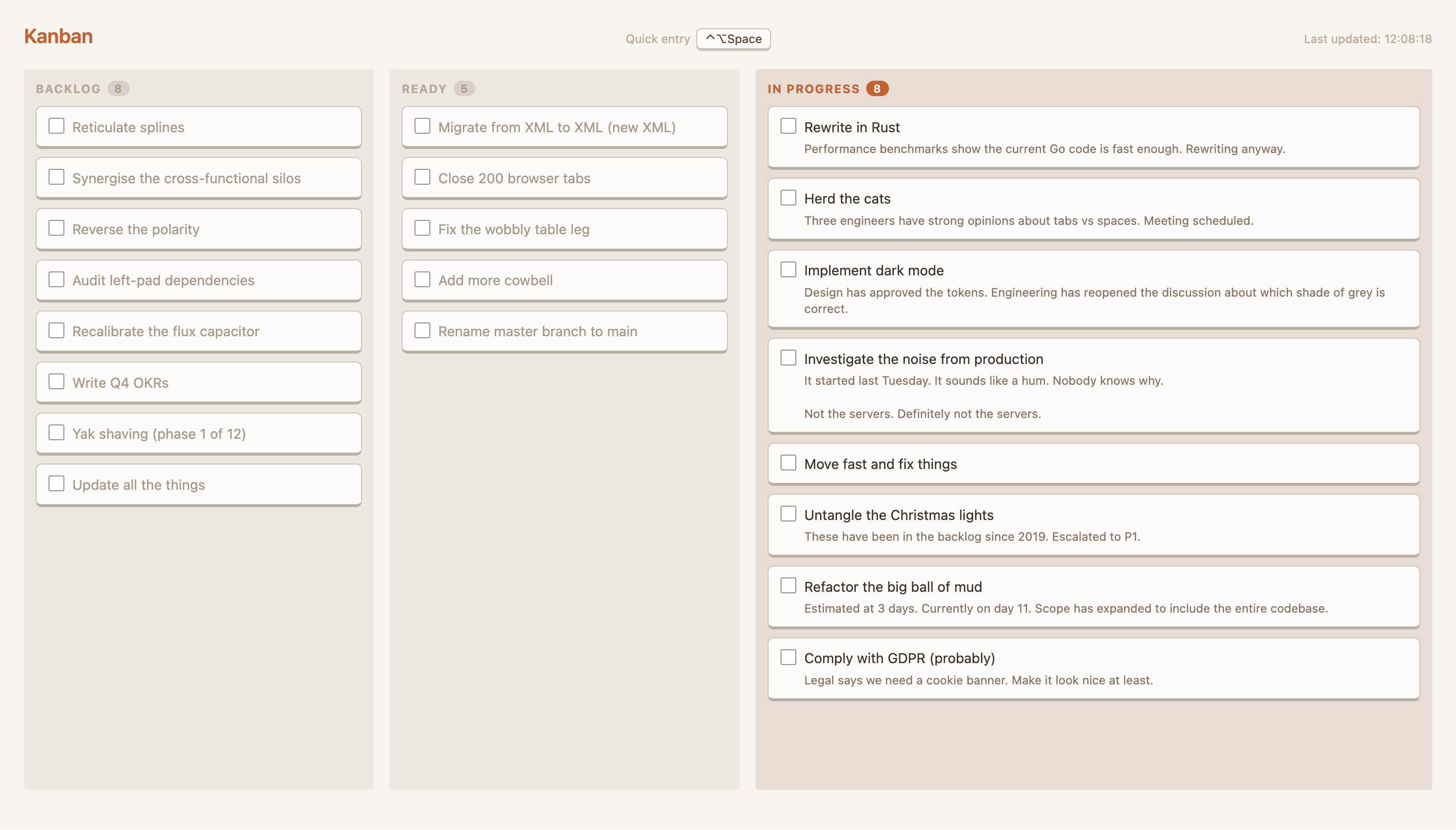
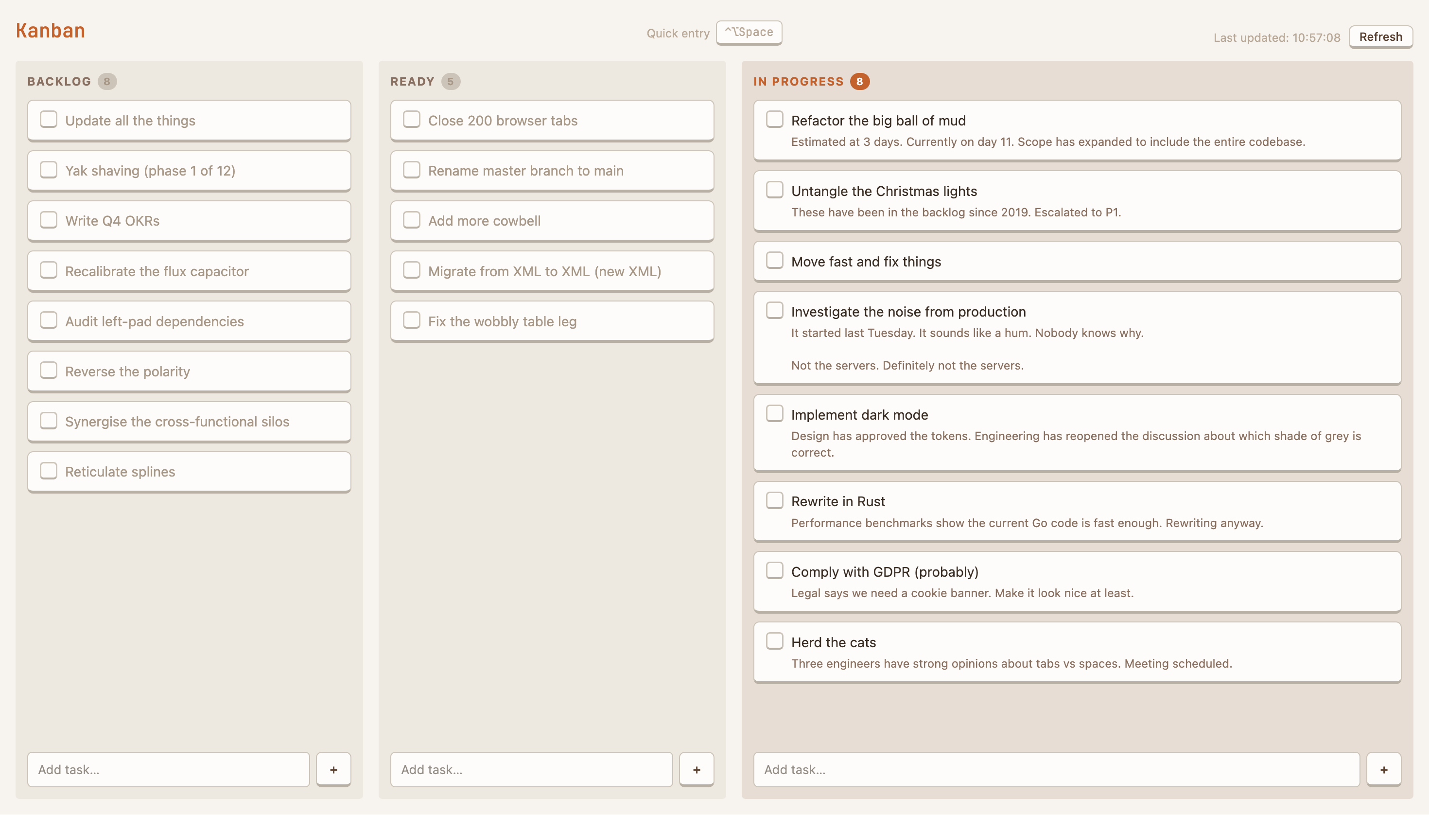
I kicked off this project while building a Kanban board application. It was looking functional but dull:
Then I prompted Claude to add a keyboard shortcut. As part of this work it came up with this little beauty:
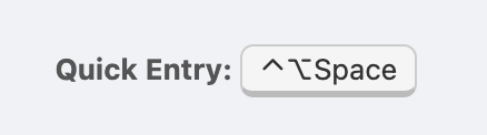
I was smitten by this slightly retro raised aesthetic. I asked Claude to make the whole thing look like the button:
That keyboard shortcut design treatment
is really great. Apply a similar style
to the rest of the application --- raised
buttons and cards.

Use a moderate contrast terracotta
colour scheme.
What came out was surprisingly good!
I think I made a couple of minor tweaks — for example the faded text for the ready/backlog columns got lost, buttons were a bit chunky to start with — but this prompt essentially did the job. The HTML app was successfully restyled:
Reuse
So now I had a HTML app in a style that I liked. But ideally I could apply this skin to other applications I build. (And it is more of a skin than a full system, if I’m being honest with myself).
In the same Claude session, so all the relevant thinking and building was in context, I prompted Claude to create a guide that would allow using this style elsewhere:
Great job on the retheming!

I really like this style and colour scheme.
I'd like to reuse it in my other projects.

Write out a design guide so that I can ask
Claude to apply this style to other applications
I made, by saying something like "apply this
design system to this application I've built".

Be sure to be quite specific --- I like the choices
we've built together for this app, so let's capture
those choices.
This extract from the current version of the ember design guide is pretty close to the original:
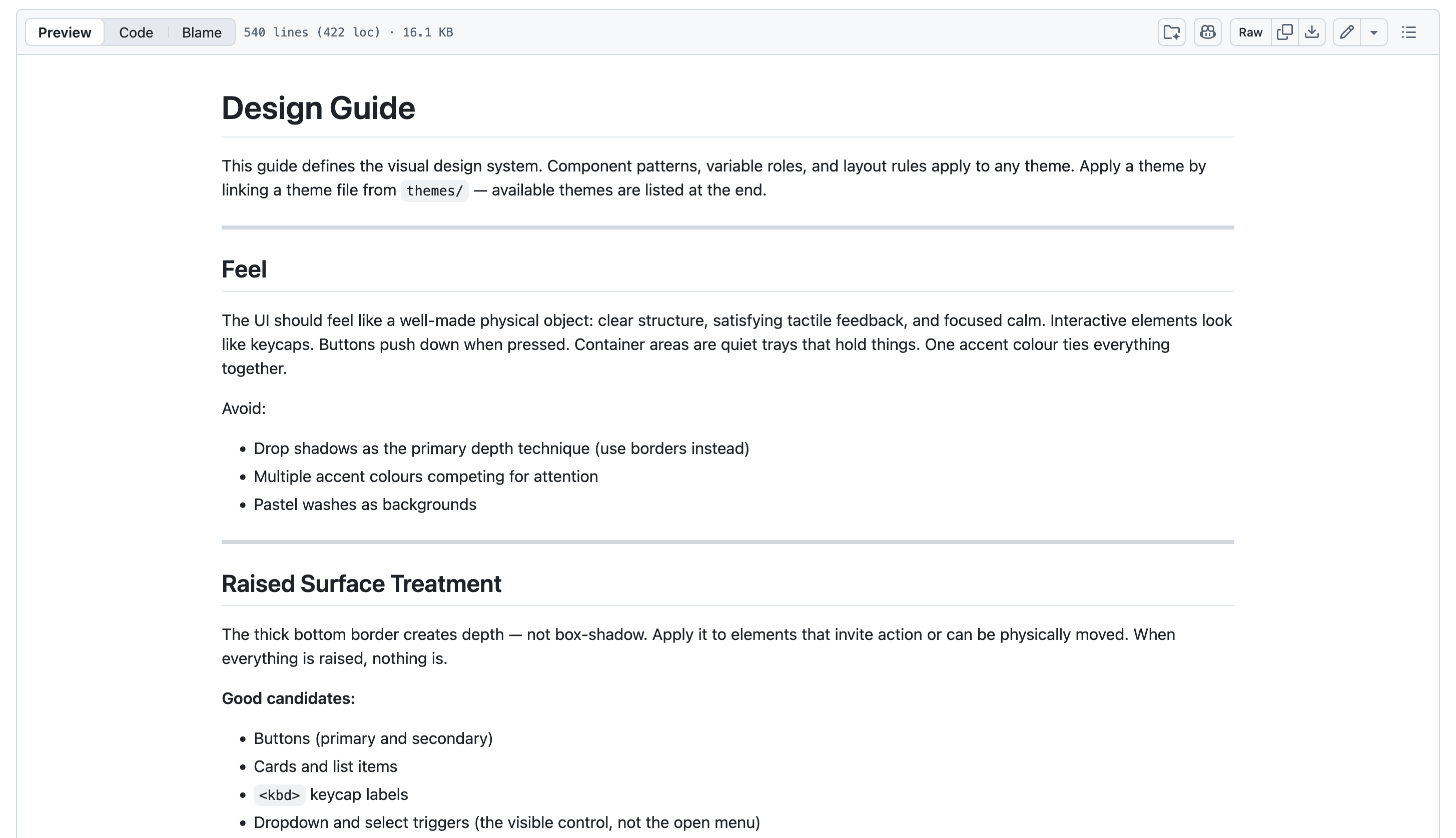
We can see Claude works by starting with the feel. Below this there’s a lot of detail on CSS classes and so on. It’s got that level of detail I asked for. I’ve tried it a few times, and it successfully styled new apps with the specifics I wanted to carry over.
Building it up
The next thing to build was a “demo” page. This contains all the components you might want to style. Having them all on one page allows quick iteration of how everything should look, and makes it easy to see how things work together. While models can generally do a good job with just the guide, for complex work the larger demo page helps.
Of course, I got Claude to build it:
Build a widgets/components demo page for this design system.
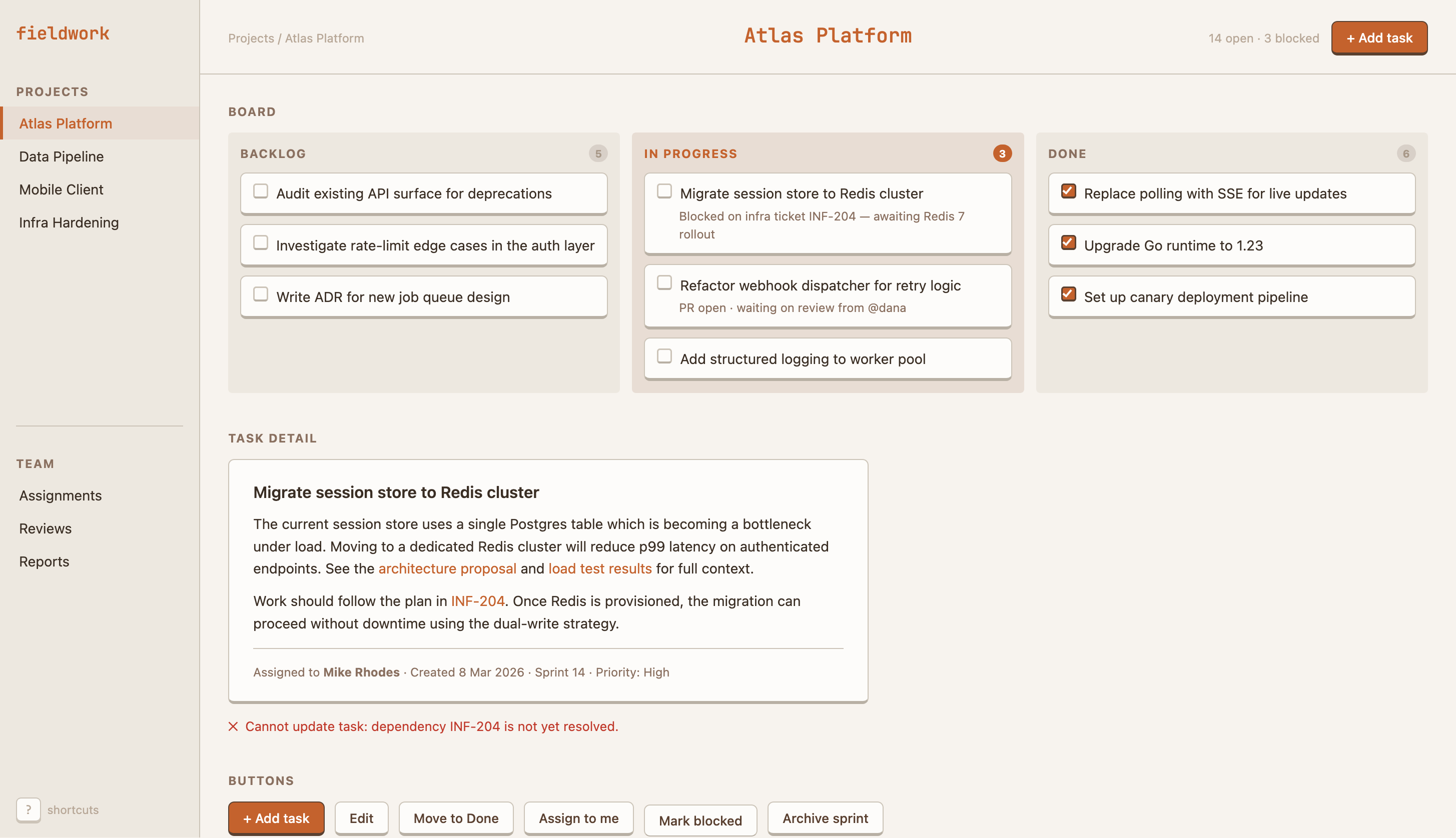
You can tell it was still in a Kanban frame of mind when it built it out; just check out the sample content:
The next step was to broaden the guide beyond the Kanban board. At this stage, the guide was quite full of Kanban terms and specifics (“tasks should have a card appearance”, “the in-progress column should be larger”).
First I asked Claude to clean out the Kanban from the guide:
This guide was extracted from the styling of a Kanban app.
Go through the guide line-by-line and remove anything
that is Kanban related, so the guide becomes general.
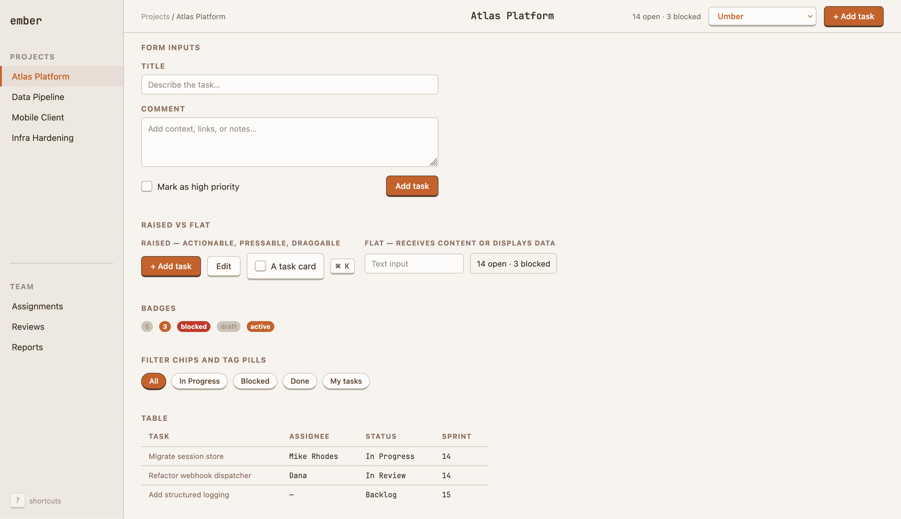
Next I asked Claude to add more components:
Fill out the selection of components for the theme. Forms,
tables, whatever else you think most apps would need.
It added the form and the table I asked for, plus badges, pills, notes on when to use raised vs. flat. Outside this screenshot there are also empty-state (eg, empty Kanban columns), callouts (warnings, tips etc.) and a swath of example text styles.
Adding colour schemes
Once we had all these things placed together, I could see the theme was hanging together well. I started to think about variations for the theme. Dark mode was an obvious addition, and it’s a short step from there to alternative colour schemes. I’ve ended up shipping a small selection:
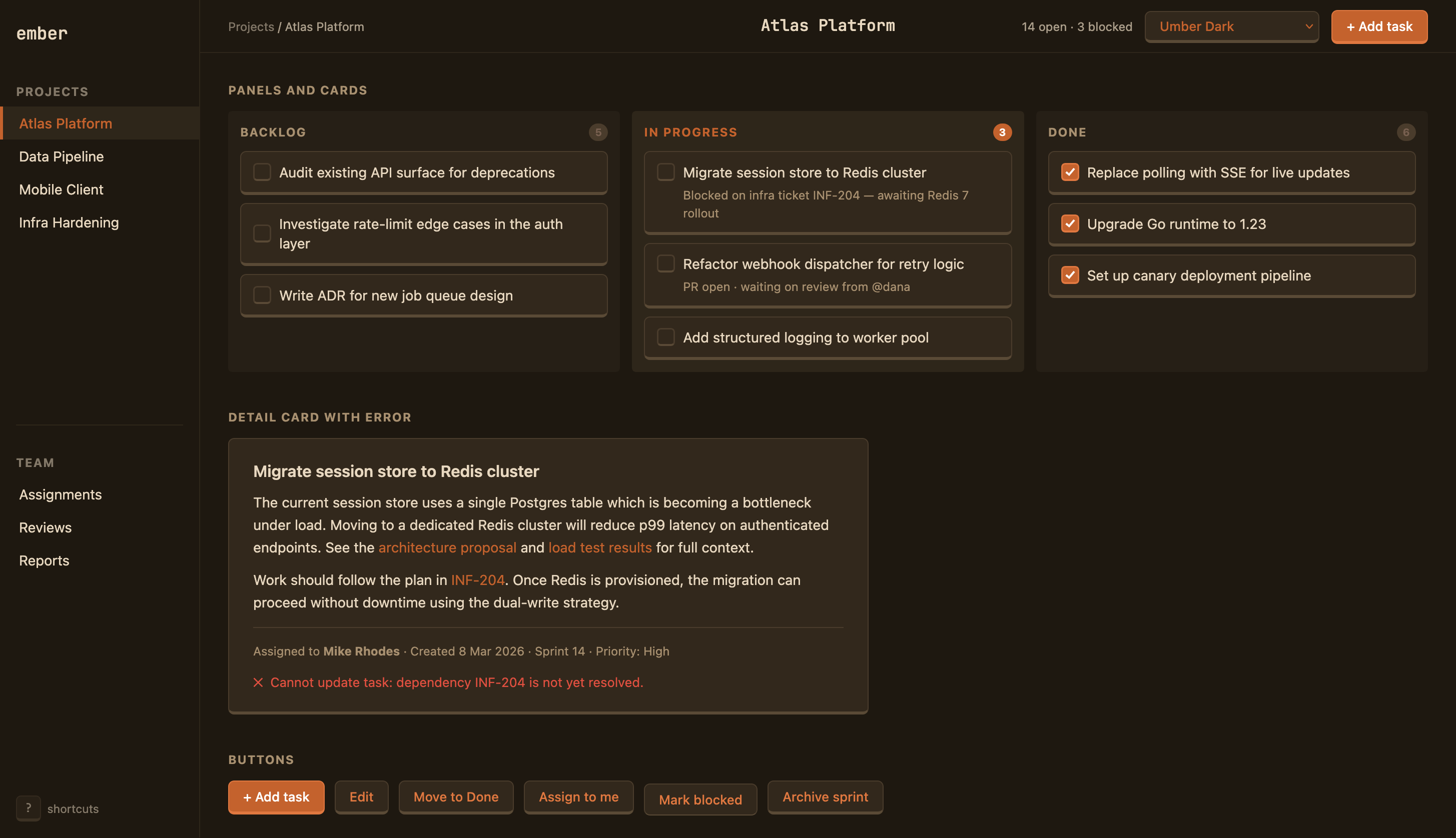
- Umber + Umber Dark — a gentle, low-contrast, friendly theme. The original theme.
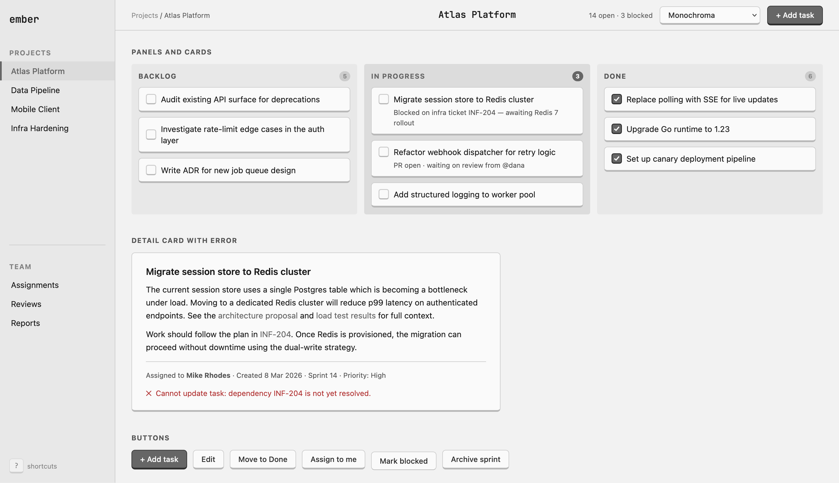
- Monochroma + Monochroma Dark — a grey-scale theme intended for media heavy sites (eg, AI image generator).
- Corporate Blues — a bolder theme, for when you want to look Business Style.
To make these, I just asked.
To create the dark mode for what became Umber:
Add a dark theme. Let's call this light theme
Umber, so we have Umber and Umber Dark.
And taking Monochroma as an example of a different colour scheme:
Let's make a monochrome theme. Still quite low contrast.
Call it Monochroma.
Things I learned:
- Yet again: tiny prompts with scant detail generated essentially what I was after. Particularly Monochroma was great right off the bat.
- The dark mode required a few tweaks. And this went slower than it should’ve done because I forgot to think for myself: instead of just telling Claude that it should use a lighter border in Dark mode to give the buttons the correct look, I took screenshots and said things like “this doesn’t look right, fix it”. What could’ve taken 2 minutes instead took 15 of silly back and forth. Lesson learned.
- Saying that, it’s impressive what Claude Code can do with screenshots. Adding a screenshot of a misaligned card and saying “fix the misaligned things” worked well.
- Once we’d got the dark mode sorted, each new theme I asked for gained both light and dark variants.
- Claude already knows lots of themes — solarized, everforest, base16. Or at least it seems to: if you ask for a “solarized theme” it’ll come up with something that looks right. This means that I don’t need to ship many themes with the skill — a user can easily ask Claude to create one to suit their app.
Making a skill
At this point, I’d built a pretty robust theming system: design guide, artifacts, multiple colour themes and a large demo HTML page to tie it all together. But everything was jumbled together: all the themes and CSS were embedded in the HTML and there were no instructions on how to use the artifacts.
To make a useful Claude skill, I needed to break things up. As most of this was simple reorganisation, I got Claude to help:
- Split out the CSS from the HTML, and make the themes further separate CSS files. That allows Claude to just load the CSS, and the specific theme it needs.
- Using sub-agents given different review goals, Claude and I worked to reduce the size and increase the clarity of the design guide.
- Got Claude to write the
SKILL.md. I find Claude is great at writing out conciseSKILL.mdfiles.
SKILL.md manually to ensure that
Claude didn’t link to the CSS in the skill folder instead of copying it into the
project folder. I was surprised by this behaviour; Claude clearly doesn’t treat
its skills folder as “special”.Show the world
Finally I wrote a readme and took a bunch of screenshots. I love me some screenshots 😀. After that, I was ready to make the repo public.
And there we have it. How I made mikerhodes/ember-system in a couple of sessions using Claude.
Here’s the current version of my Kanban app, with the full Ember treatment and some extra functionality. Claude is great at using the styling when I add new features, like the “new task” boxes at the bottom of each column:
Closing thoughts
Claude was able to do a lot of the styling work itself for this theme. This is because the theme I chose isn’t inventive. Claude already “knew” what I was after — this style would be all over the training data.
Claude would not be able to do as much of the styling by itself for more inventive themes. The technique of getting Claude to scaffold out a demo page and write the design guide is still valuable, however. Claude would be more of a junior partner in the work than it was for me — a human would put their creativity into the theme, and rely on AI for the grunt work.
But for me, this is what I wanted and needed. It might be cliché, but I like it.
🎨
Bonus content: alternatively, build a mini style library
I built up a reusable skill that can get Claude to make HTML applications look just so.
But if you’re not as fussy about the details, you can get away with just a short paragraph. Several of these “style paragraphs” can build a small library of styles kept as snippets, ready for copy/pasting into Claude while making an app. Claude will even write these up for you from a screenshot of a site you like.
For example, this theme can be summed up as:
Style this UI with a retro-raised, tactile aesthetic — as if the interface is made of physical objects. Interactive elements like buttons and cards sit above the page using a thick bottom border (not box-shadow) to simulate keycap depth, and press down slightly when clicked. Container areas are quiet, recessed trays; form inputs are flat and sunken. The palette is calm and focused, anchored by a single accent colour. Backgrounds layer from dark page → lighter container → lightest card surface, so content lifts naturally. The overall effect should feel sturdy, deliberate, and satisfying to use — not glossy or flat-minimal.